

Redoing a past favorite, “Horizon”.

This year, to bulk up my portfolio with my new skills, I’ve decided to redo some of my favorite old pieces. A lot of these pieces were also small (4x6in) pieces, so there was limited space to make them look as good, but my skills have also greatly improved (along with my patience)
To begin, I decided to do one of my absolute favorite pieces, Horizon, from 2023. This is surprisingly recent, for how much I've improved, but I've also specially studied a lot of water, along with trying to add more detail and be more patient with my art (and in general), so that could explain the skill jump.
THE PROCESS
To begin, I add a few very light washes of single colors, letting them blend into smooth gradients. This can be a slow process to get the colors nice and vibrant, but if you add too much pigment to begin with, it'll be too opaque and smear out when you add later layers.
Next, I work on the clouds, first peeling off the tape I masked them out with. Unfortunately, when I cut the shapes out, it left an indent in the paper, leading to a harsh dark outline around the clouds. I'll attempt to rectify this later. I paint wet the surface of the entire sky, then add color to try to get the clouds to blend a little into the sky. This sadly didn’t work very well at first and looked a little odd.
I then let that dry, and wet the entire water area. While it's wet, I added a seaglass color in the shapes I'd drawn out with pencil, letting it blend a little bit around, but still trying to keep a slight shape.
After that, it's several more wet into wet layers of darkening these shapes slowly. I also added back some pinks and oranges in the water where it got a bit dark and dull.
To finally add the proper contrast and shape to the waves, I gradually add hard-edged shapes inside the soft ones, doing this wet on dry.


Then I add white paint to the clouds and blend it out with water and more color. I felt this wasn’t enough, and didn’t properly cover those hard lines, so I busted out the colored pencils, and added layers of them, blending them out with alcohol markers. This was TOO white, so I added color back with watercolor and left a white outline on the clouds, which I’m not sure looks great in the end, but you can’t always have a perfect piece.

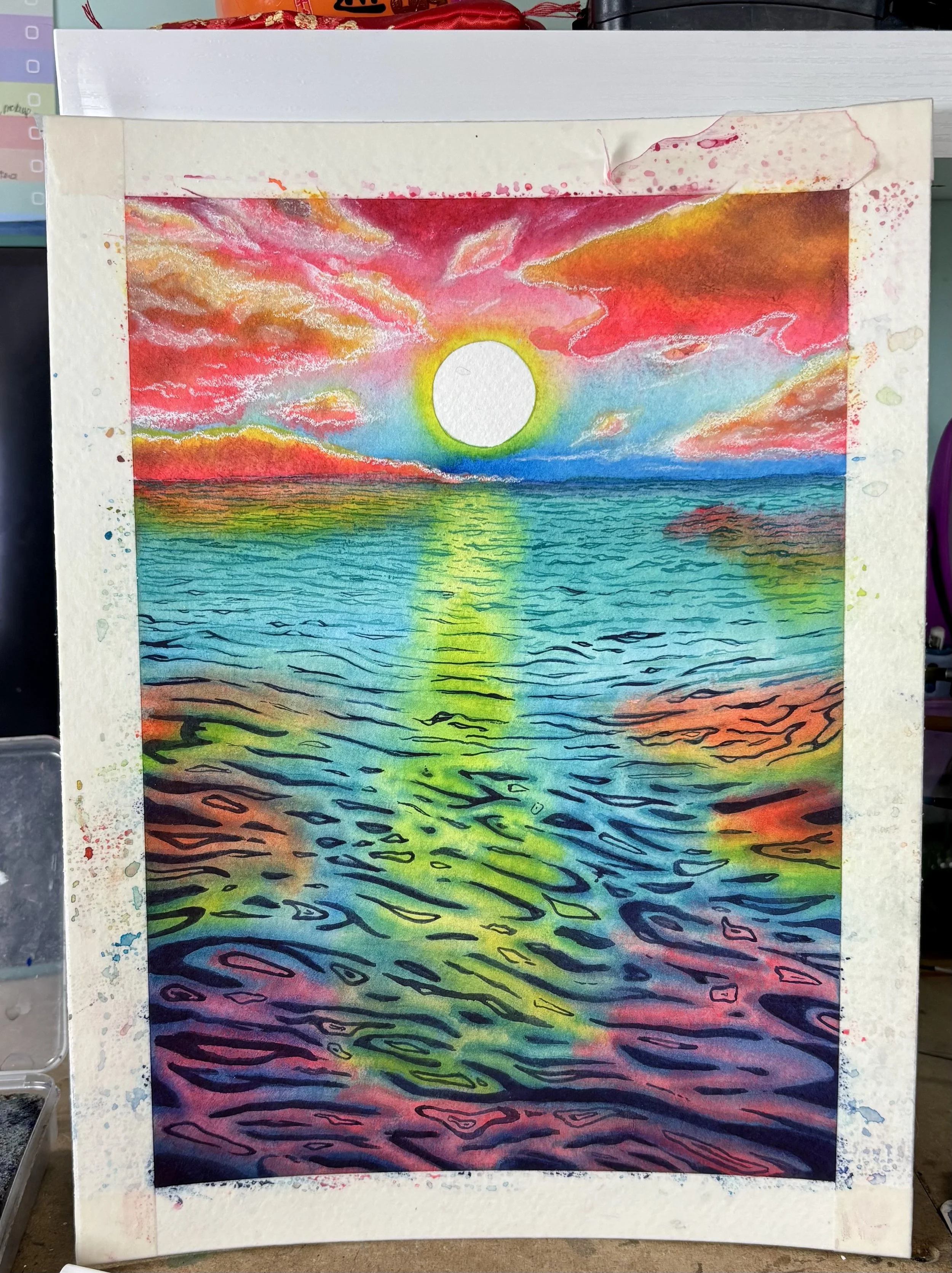

I then slowly layer up some white colored pencil on the water, around the darker shapes.
Next, I add white acrylic ink to the brightest parts of the water.
The final work I do is adding little dots and sparkles with a white gel pen. This really brings it to life, I think.
To finish the piece off, I peel off the tape on the sun and border, and sign it.
Overall, I really like the new version, and think it’s a massive improvement on the old one. The only thing I like better about the old piece is the brighter, more pastel and minty colors.
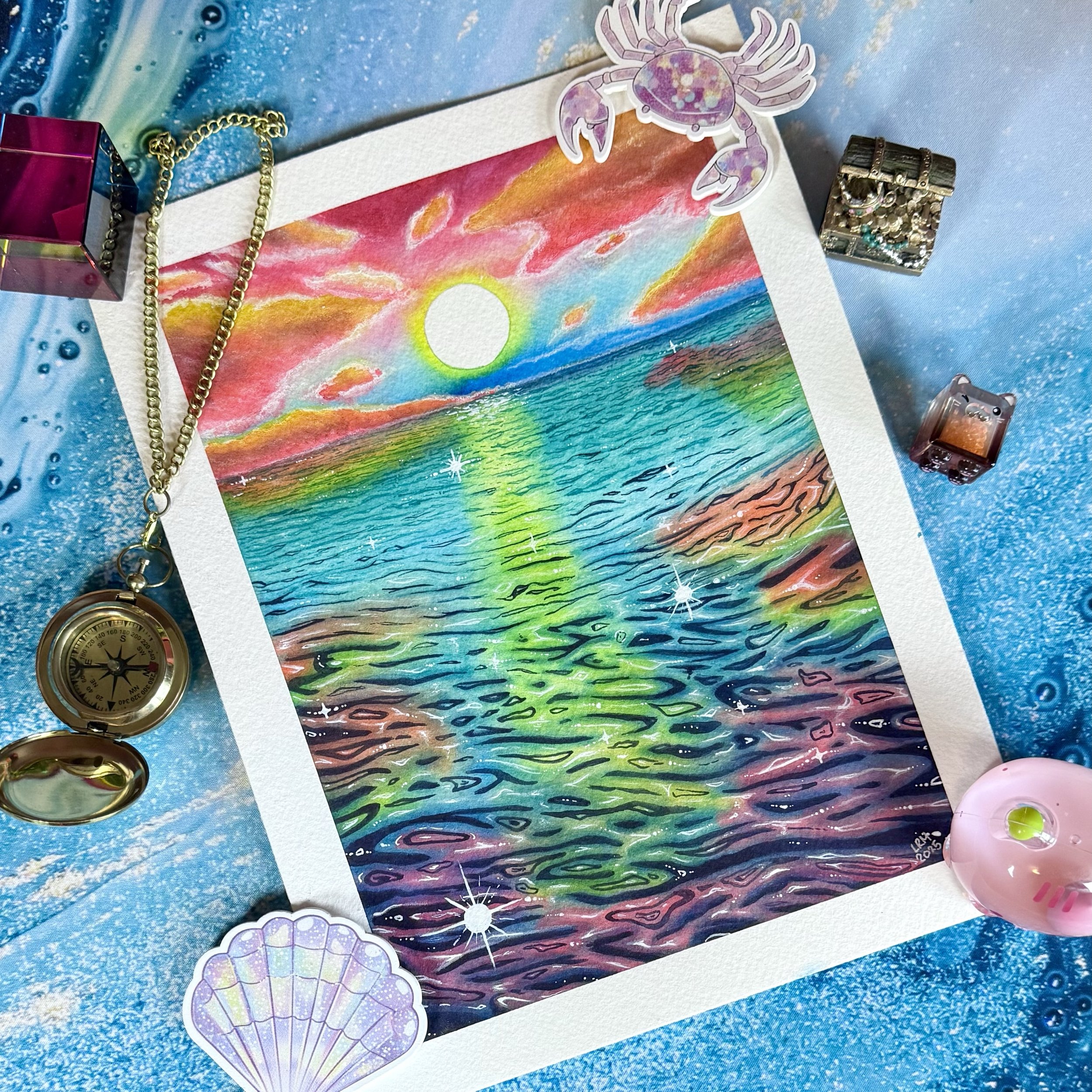

What do you think? Did I improve it?